Career Design Circle
A career companion app that helps people design fulfilling careers.

Executive Summary
Background
47% of millennials would give up a pay raise for more meaningful work.
Only 27% of college grads have a job related to their majors.
87% of global workers are disengaged from their job.
This project is inspired by the book Designing Your Life that explains how to use design thinking to design fulfilling careers.
Source: Designing your life, leaderonomics, cbc, lovellcorporation
Problem
Despite the number of online/offline resources to learn new skills, many people end up in an unfulfilling career based on assumptions, lack of support or a pressing environment leading to a low career satisfaction level.
Design challenge
How might we design a mobile and web application that help users in making a career-related change while feeling surrounded, motivated and guided during this journey?
Solution
A career companion app that allows individuals to have access to a powerful network (career coach, fields expert and fellow goal buddies) along with a tailored action plan to stay motivated while tracking their progress!

Quick sign-up
Tailored action planRole
As a solo project, I was responsible for the entire product design from user research, ideation, visualization, and usability testing.
Type: Native app (iOS)
Duration: 6 months
Matching algorithm
Powerful networkTools
Figma, Balsamiq, Pen & Paper, Google forms, Usability Hub, Whimsical.
DESIGN PROCESS
DOUBLE DIAMOND
Full case study
This project followed the Double Diamond design process model developed by the British Design Council.

DISCOVER
UNDERSTAND THE PROBLEM
POTENTIAL PROBLEMS
When it comes to a career change or improvement here are potential problems that we will validate during the research phase:
People have difficulties to articulate their own strengths
People are not always aware of opportunities because of their restricted network
`People don't trust new services easily, reviews are not enough anymore
People have to wait very long to meet or get a clear answer from a potential mentor found in a Meetup
By not finding answers online, people need a tailored solution to their career problem
PROBLEM STATEMENT
Our users need an efficient way to get support and results in their career-related decisions because they want fulfilling careers.
We will know this to be true when we see how many users are using our app to find experts/coaches to talk to along with how frequently they update their action plan.
POTENTIAL SOLUTION
A career companion app that allows individuals to get career coaching via chat or call while having access to a tailored action plan, a network of field experts and fellow career designers.

challenge
How might we design a mobile and web application that help users in making a career-related change while feeling surrounded, motivated and guided during this journey?
DISCOVER
COMPETITIVE ANALYSIS
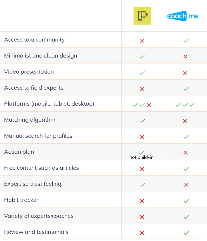
To spot weaknesses in my competitors’ user experience I have conducted for the selected competitors a competitive analysis which includes their:
Marketing profiles
Swot analysis
UX analysis
On the left, a table summarizing my learnings:

After having collected more information about the market and competition I have put together initial business requirements highlighting:
The target audience:
Aged between 25 and 45 years old where people are starting or in the middle of their careers and need some guidance towards a fulfilling career.
But also, the business risks, opportunities along with information such as the functional requirements and business scope.
DISCOVER
BUSINESS REQUIREMENTS
DISCOVER
BUSINESS REQUIREMENTS
ONLINE SURVEY
I have decided to do a survey to gain initial insights from potential users, which I explored in more depth during the interviews. Early in the process, the survey helped me tune my project idea by providing me quantitative information to understand my users’ goals and pain points, a good basis for my user interview script.
36
Participants
USER INTERVIEWS
This qualitative research method is an opportunity to gather information directly from people sharing characteristics with my target audience: career switchers or unsatisfied employees.
The goal is to get additional valuable insights to the user survey by:
Understanding user behavior when needing or giving a career-related advice
Documenting user pain points using the existing solutions on the market
Collecting data points as evidence to demonstrate to that initial design thoughts has potential
10
Participants
86%
Struggles
5
Expert seekers
24-44
Age
5
Experts
30%
Unemployed
5
Recording (Hours)
USER RESEARCH ANALYSIS
With the survey results in hands and the transcriptions of the interviews, I used the affinity mapping tool to help for grouping and understanding the qualitative data gathered.Following this exercise, I have grouped the finding into 10 groups for the expert seeker user type and 6 for the expert user type.

With the affinity mapping tool, I understood and confirmed the needs and pain points of my users. Having 2 main types of users was an extra challenge to take into account when designing the solution. Indeed, I had to do some concessions when designing for the expert seekers being aware of my experts' needs and business requirements.
However the interviews helped me tune the potential problems mentioned above, for example, my users need a personalized service with a step by step guidance but some also needed partial support and care more about their space and autonomy.For the rest of the case study, I will be focussing on only one persona: the expert seekers (The Clarity Seeker).
DISCOVER
USER PERSONA
To help me Identify collective behaviours and pain points, I first use the persona empathy map tool before building my user personas.
DISCOVER
USER FLOW
Before jumping into the information architecture phase with the sitemap, I am creating user flows for my selected user goals. Which allows me to focus on the flows instead of the individual pages. Building user flows allows me to list the type of pages needed in my app.
DISCOVER
USER JOURNEY
Focussing on the personas developed, I am now visualizing how my represented users interact with the solutions available in order to highlight product opportunities.

After reviewing my user journeys and personas I branched off to each page of the app to represent its information architecture.
DEVELOP
SITEMAP
DEVELOP
WIREFRAMING AND PROTOTYPING
From there I focussed on the 4 specific flows by sketching with pen and paper, then turning the sketches into low fidelity wireframes:
Signup and onboarding
Find a coach and book a free intro call
Mark the second task from the first phase of the action plan as done!
Find an expert web designer and start chatting with this person
Here are a few screens for the flow: Find a coach and book a free intro call

I have decided to keep my wireframes in grayscale to help me focus on the usability of the application while designing.
To get ready for usability testing, I turned my mid-fidelity wireframes into clickable prototypes, one of the best ways to express how the application is meant to function. I have used the Figma's prototyping tool for this purpose.
DEVELOP
USABILITY TESTING
The clickable prototype has been shown to potential users to collect initial feedback on the usability of my design solution.
For this first run of tests, I have opted for moderated in-person and online sessions, to be able to observe people's behavior (body language) and ask follow up questions.
⚽️
Method
Moderated in person
⌚️
Duration
20-30 mins each
I re-used the affinity mapping tool to analyze my data and identify patterns of repetitive issues encountered by the testers.
AFFINITY MAPPING

💻
Equipment
Iphone 6
Macbook
QuickTime
RAINBOW SPREADSHEET
To help me visualize better patterns and prioritize issues based on the severity of the error or observation I have used the rainbow spreadsheet that included in total 25 observations and respective potential improvements solutions that I will partially present in the next section.

👥
Participants
6 total
2 m / 4 f
25-35 yo

DELIVER
DESIGN ITERATIONS
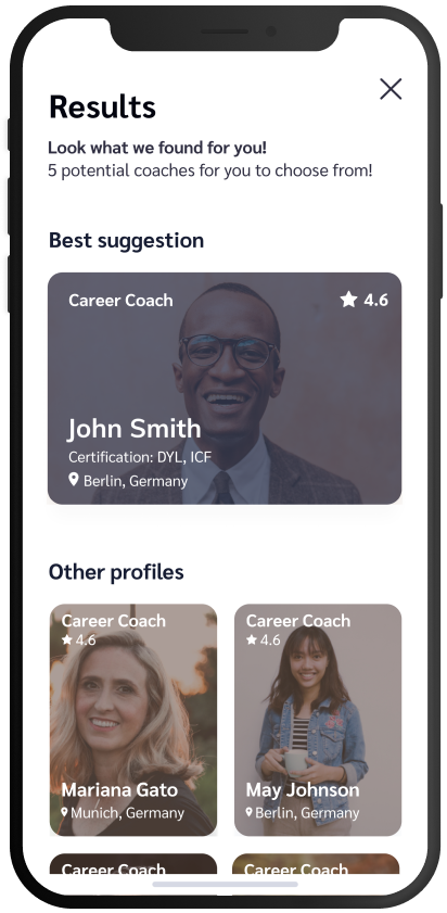
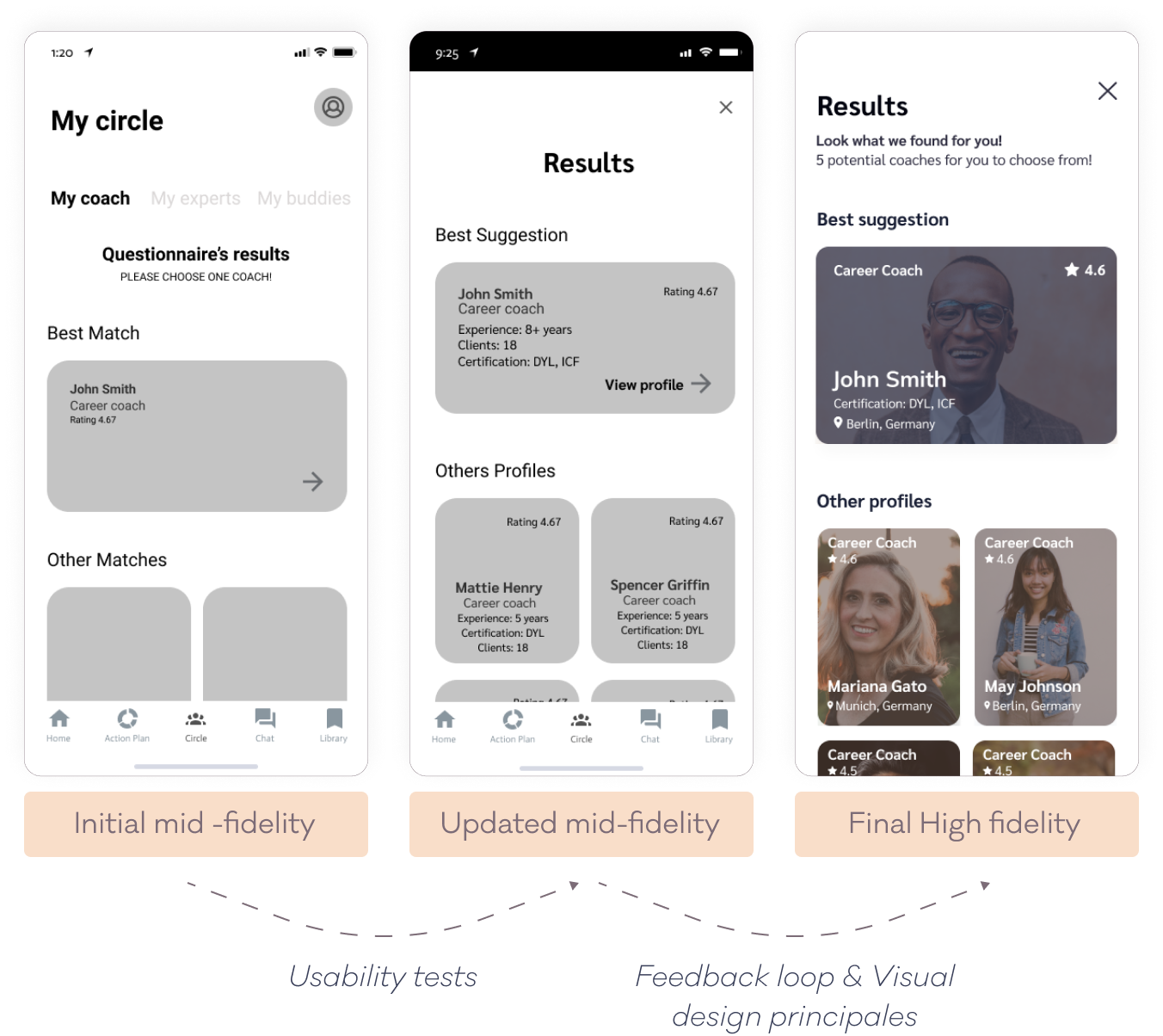
SEARCH RESULT - MATCHING QUESTIONNAIRE
The usability test showed that when looking for a coach 83 % of participants stopped in the middle of the flow thinking that the coach has been assigned automatically.
Solution: The main changes are the screen simplification and the fact that I made the screen a pop up (closable) and removed the tab bar and screen tabs for a full focus in this important task's accomplishment. Indeed, booking a call is the main source of revenue for the business.

BOOKING A CALL - SELECT A DATE AND TIME
This screen was pretty much the same during the iterations but after the feedback loop, I realized that the screen could be simplified and the task perceived less overwhelming by applying the Gestalt Principles.
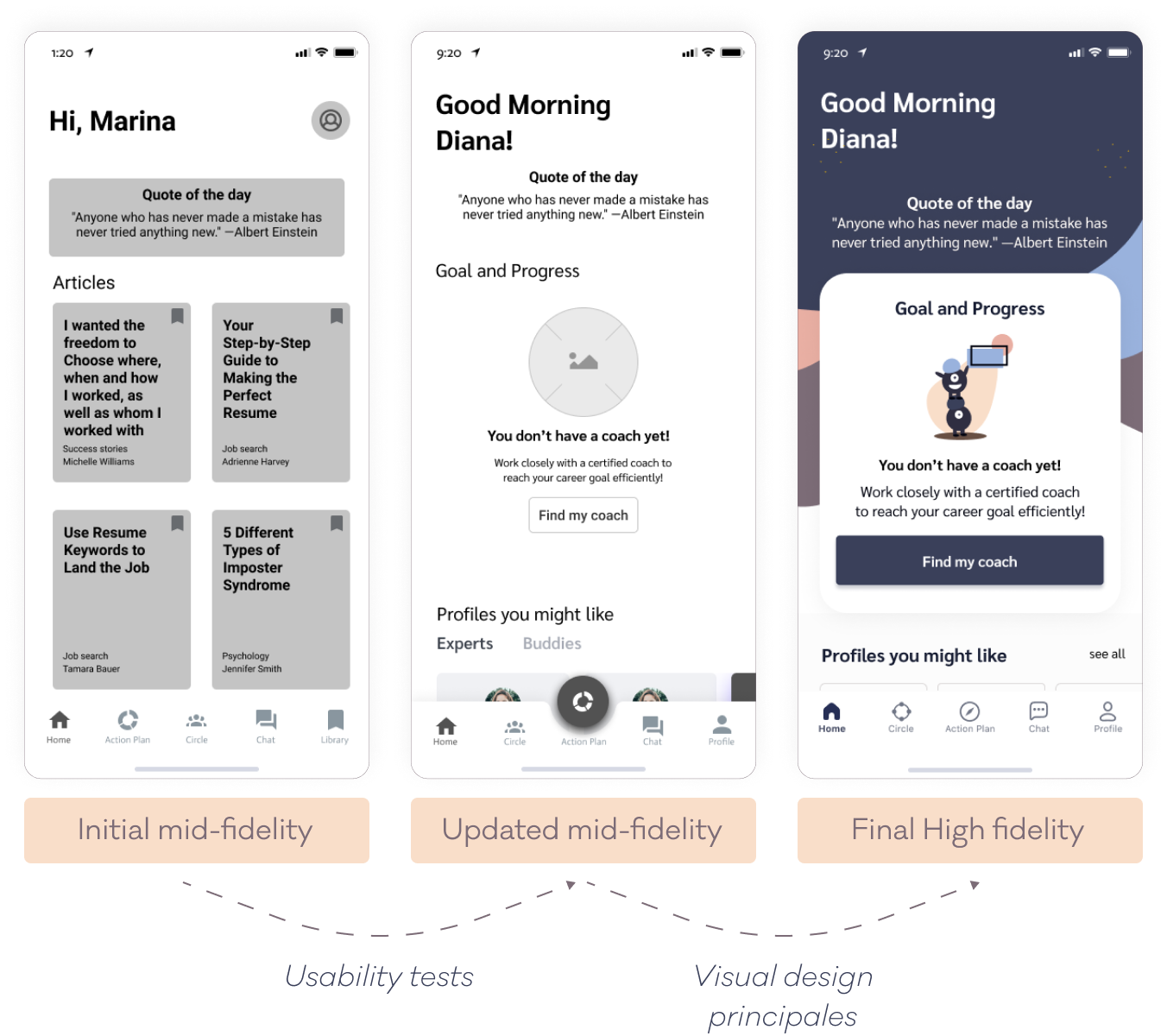
HOME SCREEN - RETURNING USERS
Despite the simplification brought to the screen after the usability tests, the screen initial high-fidelity color combination had a poor contrast ratio not passing the required WCAG AA level, therefore, a change of the background colors and an increase of the font-size makes the content easier to consume.

FIND A COACH - MATCHING QUESTIONNAIRE
Showing my design to fellow designers made me improve this screen: by specifying how many answers are selectable, increasing the font size and removing the unnecessary next button.
“After I select the field it should move to the next page right away. Selecting the "next" button seems an unnecessary action.”
“Maybe state if I can click multiple?!”
“Matching questionnaire: This text is really hard for me to see, the size it is now.”
COACH PROFILE - CHOOSING A COACH
Choosing a coach is an important task for the app. Therefore during the iterations, I improved the accessibility of the information needed for my users to make a quick decision on a coach profile: Bio, clients, articles, and reviews are now presented in tabs instead of vertically in the initial long page that needed a lot of scrolling.

HOME SCREEN - NEW USER
The usability test results have shown that 50% of the testers found the screen empty and weren’t sure about what to do next despite having given them a task.
Solution: I use an empty state to fill the temporary content of the goal overview, I also used visual design principles such as the law of proximity to help the user focus on the main action required from this screen, which is to find a coach.

ACTION PLAN - FULL VIEW
66% of the participants couldn’t update a task smoothly which engendered a lot of frustration and shows that the users' mental models made them use my app differently than expected.
Solution
- The white circle is now clickable like my users' mental model expects it and I also remove the swiping.
- Once a task is completed, the screen now shows the updated remaining number of tasks.
- I also added an arrow to clarify that more can be read about a specific task.

DELIVER
STYLE GUIDE

DELIVER
FINAL DESIGN
DELIVER
PRESENTATION
CONCLUSION
KEY TAKEAWAYS & NEXT STEPS
Key-Takeaways
-This UX project was enriching. I learned that a well-documented process was key to the accomplishment of this challenge.
- The topic of accessibility was inspiring, one of the latest iterations was about applying accessibility best practices to the app. This is something I would keep in mind and anticipate in my next projects.
Next Steps
- Run several usability tests
- Design for tablet and desktop
- Add additional flows
- A/B & additional preference tests
Want to work together?
Want to work together?
If you like what you see and want to work together, get in touch!