German health insurance by Bettina
Many companies spend a significant amount of money and effort to bring traffic to their website with PPC, SEO, social media campaigns, but unfortunately not making the most of this investment by not applying basic design principles.
For this project, despite the presence of interesting design elements, I decided to redesign the landing page that GERMAN HEALTH INSURANCE (Bettina Ostermann) is sending paid traffic to.
This is a personal project.
Design challenge
How might we design a landing page, which brings trust, clarity for expats or future expats in Germany looking for a health insurance?
Role
Competitive Analysis, Ideation,
Wireframing, Prototyping
Type
Landing Page Design and Conversion Rate Optimisation
Tools Used
Figma, Usability Hub

Assess the current design
On top of some obvious improvement opportunities applicable to Bettina’s website I have decided to run a 5 seconds usability test to assess how clear and rememberable is the hero section of her landing page.
This test is used to measure the effectiveness of the design and messaging! By consequence, I have shown the hero section of the current design to 50 people who were unfamiliar with the company and asked them the following questions:
Q1: What is the name of the company?
12% of them could say that the company name was Bettina Ostermann. However the ambiguity of the design also suggested that the name could also be "German Health Insurance". I decided to only accepted answers stating Bettina for simplicity.
Q3: What value does the company offer to its users?
Regarding the last question about the value that the company is bringing to its users, only 14% managed to share a valid value such as: security, reliability.
Q2: What does the company sell?
24% could tell what the company is offering as a service, I accepted all answers stating health insurance.
As you can see there is some room for improvement - let’s make some changes!
Landing Page Audit and AIDA optimised Redesign
I have performed a general website audit following the AIDA Sales Funnel.
AIDA highlights the idea that people will be acting differently and also have different needs at different level in this sales funnel. Therefore, as a designer I need to design a harmonious landing the page ensuring to grab our users attention regardless of the stage the users are in!
A I D A
AWARENESS
A I D A
INTEREST
A I D A
DESIRE
A I D A
ACTION
For the people in the awareness stage, the level of commercial commitment is very low, indeed, users have a lot of distraction in their life in general, therefore it’s important at this stage to grab their attention in few seconds!
What can be done at this stage is to trade value for awareness, because Bettina’s services are already free I would suggest her to focus on building trust, credibility, clarity and quality as quick as possible while visitors are browsing the website.
Here are elements that I changed for this purpose:
- Change the headline and sub headlines
- Add the name and photo of the service provider (Bettina)
- Make sure the customer reviews are mentioned above the fold with direct link to the specific section
- Avoid spammy looking text (I have removed the "It's FREE"), the page should not be screaming at users.
- Remove few bullet points to make the content easy to process
Once trust and clarity are shared via the design, it will be then easier to take the users throughout the rest of the stages.
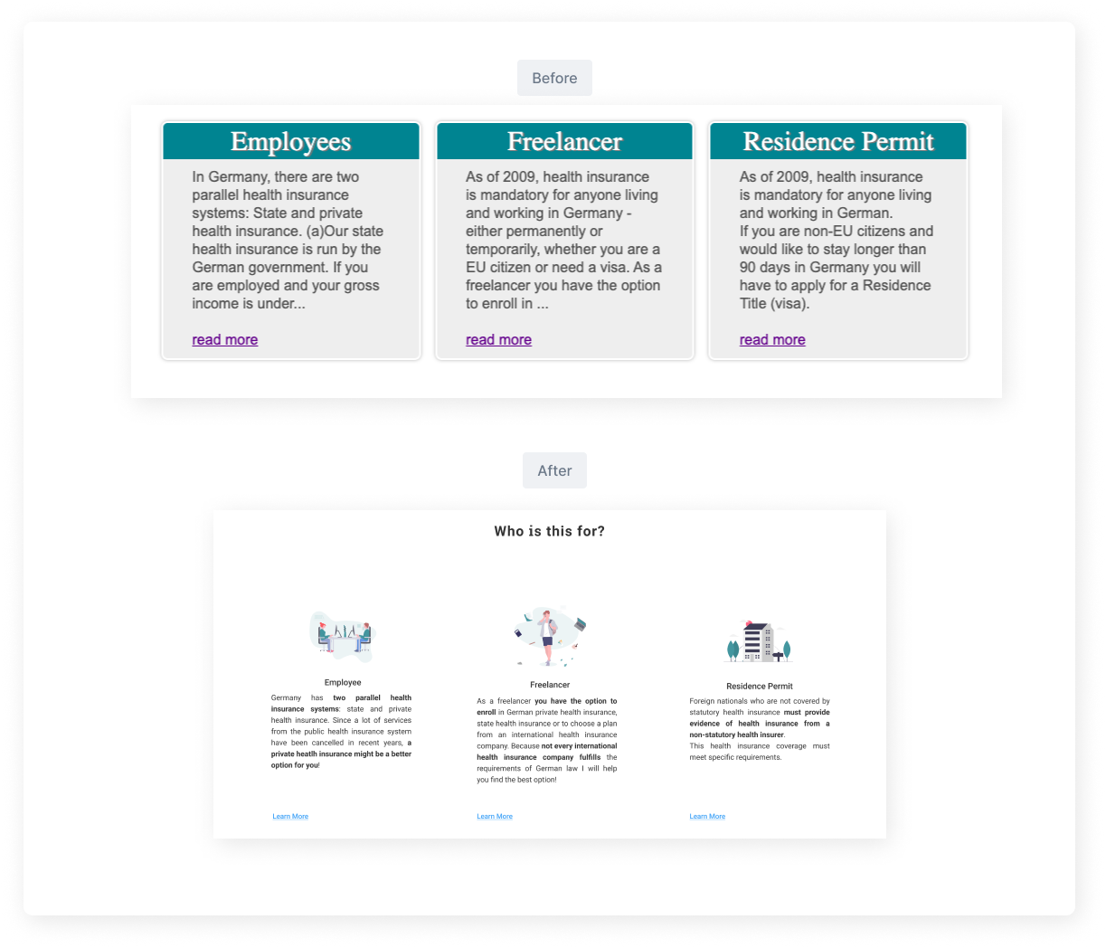
During this interest stage the users are interested in knowing more about the service, he or she is now seeking for more information. Despite having a real interest at this stage, the user has a medium level commitment to the service, we then need to help them to move to the next stage.
Here are elements that I changed for this purpose:
- I have created questions and answer based sections giving more information about what the service is about.
- I also decided to keep the personal based selection content type to ease the visitors' identification to Bettina’s services (which is also a way to validate for the user that she or he is in the right place).
I have added to the original version an illustration to give a clearer context to the user. Because at this stage people don’t read but rather scan, I am therefore bolding important keywords to attract the users' eyes and ease the identification.
If you managed to take your visitor to this desire phase - congratulations! In this stage the users made the decision that they want the service, their level of commitment is high and they are looking for extra details and information. In this desire phase users are transitioning from scanning to reading our content! This is where elements such as case studies, reviews, FAQ’s are welcome.
For Bettina's website I have decided to improve:
- The review section design by showing the photo of the client and ideally upon approval to link the review to their Linkedin profile for more authenticity. The “comparable", is very powerful at this stage because when reading the reviews the user need to be able to compare his/her to the previous clients.
- Having a blog on the website is interesting, it can show your expertise in the field by providing free and insightful content to your visitors.

When a user is in the action phase, he or she is ready to become a customer. At this stage we need to be careful and not waste the effort made so far as the customer level of commitment is the highest.
As the user is literally ready to buy from us the process needs to be as easy as possible:
- Bettina’s form is overwhelming at first, I have removed few fields in the form

Defining tone of voice using the Fogg Behavioural Model
The Fogg Behavioural Model explains that three elements must meet for an action to happen. Combined with the AIDA funnel I am using the Fogg Behavioural Model to set the Tone of Voice of my landing page design for Bettina.
Which one should I take for Bettina’s website?
The Spark trigger is ideal when the users’s perceived difficulty is low (they think it’s easy) but the motivation is low too. In this case we need to motivate them with a general tone and CTA motivating such as: "eg: signup and you will get x percent off”.
The Facilitator trigger should be used when the user have a lot of motivation coming to a website but is more likely to see the process difficult (perceived difficulty is high) in this case we need to use a CTA and general tone of voice that convey the simplicity of the action, users need to feel that we going to take care of everything for them.
The Signal trigger is just neutral triggers.
I have decided to go for the facilitator trigger based on our user scenario, these people are highly motivated to get an insurance as it's compulsory but they don't want to struggle that much while accomplishing this task.
I am deciding to set a tone of voice and a design that make them feel taking care of.
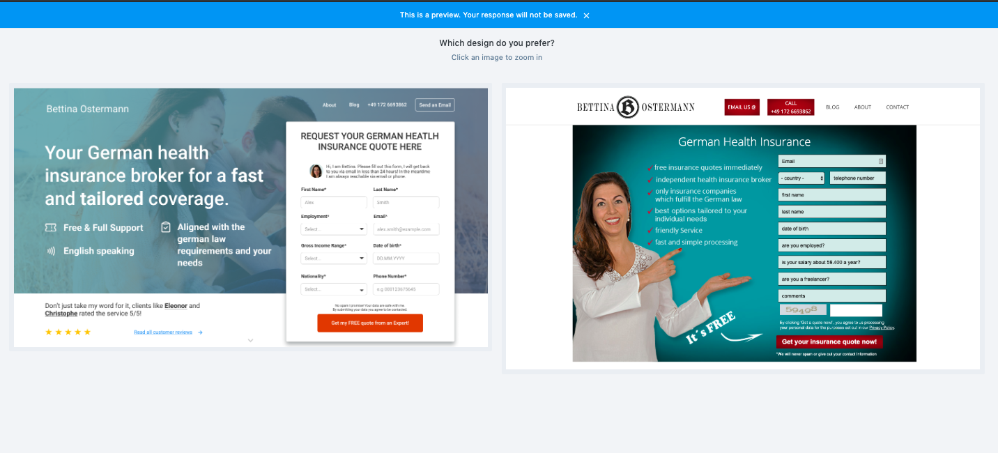
FINAL REDESIGN
FINAL REDESIGN
This is the final design. To assess if my design has chances to increase the website's conversion rate I have decided to run another 5 seconds usability test and compare the results with the initial one. And a preference test to collect qualitative info on these two designs.
5 seconds test
To assess if my design has chances to increase the website's conversion rate I have decided to run another 5 seconds usability test and compare the results with the initial one.
5 seconds test on the new design:
Q1: What’s the name of the company? Q2: What does the company do? Q3: What value does the company offer to its users?
eg: Compared to the first version the time spent to answer the question : What's the name of the company? decreased by 31,44% .
eg: Compared to the first version the number of people who replied correctly to the question : What's the name of the company? increased by 16.67%
Test conclusion
As you can see, the new design is globally better than the original one. The main improvement as been done on showcasing what the company does, there were 83% more people able to give a correct answer to the question: what does the company do?
Regarding the two other questions:
What’s the name of the company?
What value does the company offer to its users?
There is an improvement but knowing that I asked 50 people the difference is actually very subtle.
The other point is that from the two versions people spent much less time (about 45% less) to answer the questions from the new design perspective. We can then assume that the design was more clear and straight to the point.
Because I don’t believe on assumptions I have decided to run a preference test that provided me with some quantitative and qualitative data!
I provided the participants with the hero section of the two designs, asked them to choose their favourite.
The redesign is performing better (is preferred), and the difference is 99.0% likely to be statistically significant. This means that we can be very confident that it is actually preferred, and not due to random chance.
Preference test
I also asked them to give the reason of their choice, here are some answers:
Usability tester
“It’s more understandable and better looking”
Usability tester
“Clean, modern, professional...the other one looks like a flyer for a lawyer you find in a motel room in the middle of nowhere.”
Usability tester
“It feels more modern and focused on Expats... the other design feels like it's an older German website that probably isn't great for non-German speakers. This one feels current and fresh, and the main message is a lot clearer. It feels trustworthy.”
Usability tester
“The overall design puts more focus on the form whereas the other put focus on the woman which distracted me. The form in the version I chose looks more modern and visually appealing, too.”
Usability tester
“Second one looks too pushy and less serious. This one looks more professional.”
Conclusion and next steps!
- My logo alternative is not standing out enough, despite the small clarity improvement based on the 5 seconds usability test, I can conclude that I didn't manage to significantly improve the result for the question: What's the name of the company? It’s worth redesigning the logo to get a better contrast!
- The current blog is hosting outdated blog posts, the last blog post is from 2015, which might impact the trust level of visitors!
- I would suggest Bettina to match the google ad copy with the one in the hero image as much as possible to not confuse users even more when they land on her website.
- I would run some A/B tests on the H1 and sub-headlines along with testing showing the form as an overlay (the form might stop users to sign in).